


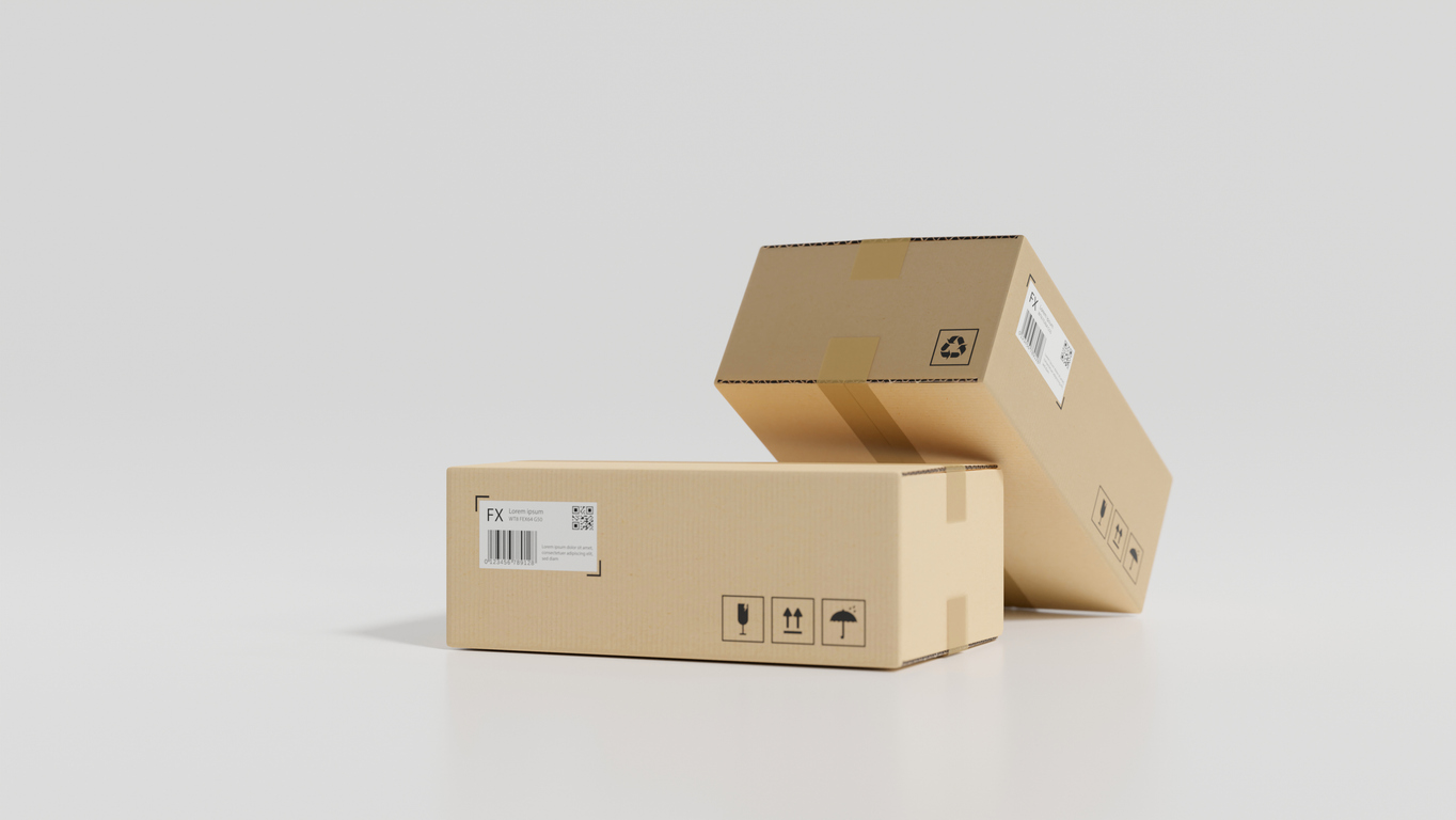
Returns, Shipping, and Guarantees Are Conversion Content
Some of the most consistent lifts come from the cues that reduce uncertainty, improve discovery, and enhance user experience.
Trust and value reassurance.Filters.Category chips.Navigation elements that help shoppers find the right product faster.
Because shoppers are not only asking whether they want the product.
They are also asking how quickly they can get to the right optionand whether they should have confidence and trust their decision.
When those questions are answered early, conversion friction drops.
That is why returns, shipping, and guarantees matter more than most brands treat them.
Most brands still treat returns, shipping, and guarantees like operational copy.
Necessary.Useful.Legal-adjacent.Best tucked into a footer, an FAQ, or an accordion somewhere below the “real” selling content.
That framing is wrong.
Because these policies are not just about what happens after the order.
They shape whether the order happens at all.
The Real Problem Isn’t Policy. It’s Placement.
A lot of ecommerce teams assume that if a policy exists, the job is done.
It isn’t.
Customers do not reward you for having a fair return policy they can’t find. They do not feel reassured by shipping information buried three clicks away. And they definitely do not translate a hidden guarantee into confidence at the moment of commitment.
The issue is rarely the existence of reassurance.
It is whether reassurance shows up at the exact moment doubt appears.
That moment is usually much closer to the buy button than brands think.
What First-Time Buyers Are Actually Trying to Resolve
Returning customers already know how your brand behaves.
First-time buyers don’t.
They are not just asking, “Is this the right product?”
They are also asking:
- How fast will this actually get to me?
- What happens if it doesn’t fit, work, or match expectation?
- Who absorbs the mistake if I get this wrong?
- Is there any real backstop here, or am I on my own after checkout?
That is why this content matters so much more for net-new visitors.
Returning customers buy with memory. First-time buyers buy with uncertainty.
And uncertainty doesn’t always need more persuasion — it needs better resolution.
Why Footer Content Underperforms
Footer content assumes the shopper is already committed enough to go looking for answers.
Most aren’t.
Especially not on mobile or paid traffic. And especially not when they’re comparing three brands in ten minutes and feel no loyalty to any of them yet.
When reassurance lives too far away from the decision zone, one of two things happens:
The shopper leaves the page to find it. Or worse, they don’t bother — and leave the site instead.
Either way, the conversion path gets taxed by a question the page should have answered natively.
This is where a lot of teams misread drop-off.
They think they need a better headline.A stronger offer.A louder promo.Another benefits block above the button.
Sometimes that’s true.
A lot of the time, the purchase just still feels slightly unsafe.
The Shift: From Policy Copy to Decision Support
High-converting brands treat returns, shipping, and guarantees less like compliance content and more like buying infrastructure.
Not bigger policy pages.
Smarter placement.
That usually means surfacing shipping expectations near price or Add to Cart.Summarizing return terms in plain language before the user has to hunt.Making guarantees feel concrete, not decorative.Linking to full details without forcing the shopper into a research detour.
The goal is not to dump legal copy into the buy box, but to answer the specific risk question forming in the customer’s mind before it turns into hesitation.
That is a very different job.
And it usually takes less copy than teams think.
Microcopy like “Free 30-Day Returns” near the call-to-action button can do more commercial work than a beautifully written policy page hidden in the footer.
A delivery estimate placed near intent can matter more than a general shipping page in global nav.
A clear guarantee stated in human language can outperform a cluster of trust badges that looks reassuring but explains nothing.
What This Looks Like in Practice
The best reassurance content is compact, specific, and placed near commitment.
It does not interrupt the sale — it completes it.
On a PDP, that might mean a tight block near the buy zone covering delivery timing, returns, and guarantee language.
On a collection page, it might mean small transactional cues that reduce fear before the click.
At checkout, it means removing surprises — not introducing them.
The principle is the same across all of it: do not wait for the customer to become anxious enough to open your policy pages. Design the page so they don’t need to.
Decision Support, Not Footer Copy
Returns, shipping, and guarantees are not “extra” content, they are part of the product.
At least psychologically. Because the customer is not only buying the item, they are buying the consequences of being wrong.
And first-time buyers feel that most.
So the question is not: do we have good policies?
The question is: can a cautious buyer see them, trust them, and use them to move forward without leaving the page?
If the answer is no, that content is not supporting conversion.
It is sitting in the footer, waiting to be discovered too late.
